AiW note: Ahead of the announcement of the winner of the GBAS Book Cover Design Awards tomorrow, December 1st, we have been able to catch up with two of the finalists, Casper Schutte and Marius Roux. We asked them some of the same questions and honed in on specifics relating to each of their nominated cover designs.
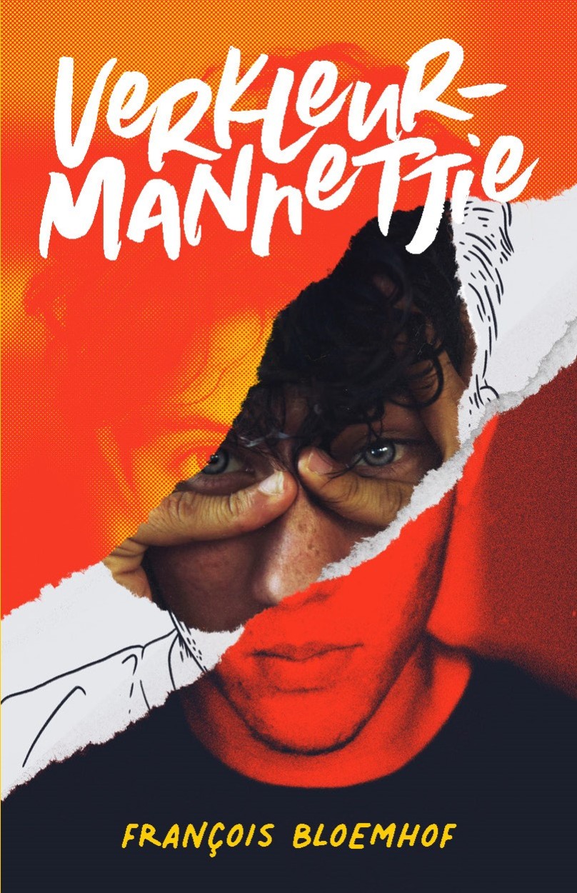
Casper Schutte is nominated with his cover of Verkleurmannetjie by François Bloemhof (2021) in both the GBAS Book Cover Design Fiction and the Excellence in Illustration categories. Here, Casper takes us right back, talking with us about the sparks of being a book cover designer to the processes behind his design for Verkleurmannetjie; the “acacia tree meme” gets a look in, and Casper also gives us some of his favourite book cover (and book reading!) recommendations…
![]()
Katie Reid for AiW: Congratulations on your cover being selected as a finalist in the first GBAS Book Cover Design Awards, in both the Fiction and the Excellence in Illustration categories – it’s a beauty – and thanks for talking with us today.
Perhaps we could start at the beginning – could you tell us a bit about your work and your path to becoming a book cover designer, how you discovered or nurtured the spark for it?
Casper Schutte: As an avid reader, I’ve always wanted the opportunity to do book covers. It’s design at its purest, we have to visually communicate the themes and story of the book while ensuring that it will stand out on a shelf and engage the right readers. While reading a book I sporadically look at the cover to “ground” myself in the story and atmosphere of the book again. In 2019 I started my own company Spook Design Co. and book cover design was on my bucket list, so when Lapa contacted me for this cover I jumped at the opportunity. In primary school and high school I used to read François’ books until the pages came loose, so when I found out who the cover was going to be for, I had a bit of a “Mama I made it” moment.
AiW: What’s your creative approach to cover design, say, when you receive a new project? What do you look for first and how does it unfold from there?
CS: The first thing I do is read the book. It’s obvious to me when a designer hasn’t read the book, or only read the Sparknotes. While I’m reading I make notes of the themes, characters and story points that I could make use of on the cover. I then eliminate all of the ones I think could spoil important story beats, since my job is to give the reader a taste and not the whole plate.
Then I start looking at other book covers, movie posters and other design collateral around the world to see what is out there, so I don’t do something that seems too generic or influenced. After that it’s sketches and sign off on the general idea of the cover. And then lastly the easiest bit, actually designing the cover.
AiW: Could you say a bit more specifically about your process behind the design and rationale for this nominated cover, of Verkleurmannetjie (YA fiction by François Bloemhof, published by LAPA Uitgewers, 2021)?
 CS: For this cover, I wanted to communicate the sense of dread and foreboding that runs through the story. Something is wrong, but you don’t know exactly what. I also wanted to portray the violence (both physical and emotional) that the main character Marco experiences throughout the book, and lastly I wanted to communicate the main theme of the book, the idea of putting on masks to please the people around us (hence the title of the book ‘Verkleurmannetjie’ which means ‘Chameleon’).
With all of that in mind I started looking for the face of the cover, someone that matches the description of the main character, and I was lucky to find the photoset that I used. It was honestly a bit of a happy accident, when I saw the two images that matched so perfectly, one of the main character looking straight forward and one of him in agony, clutching his face, I knew immediately that this is what we’re doing. I used the tear motif to symbolise the violence I mentioned above, and the different duotone effects and illustration to communicate the ideas to Marco’s changing personality.
Lastly we looked at the typography, going through a few different options, you’d be surprised how a different type treatment for the title can change the tone of the cover. We settled on this messy hand-drawn scrawl that fit with the themes of the book.
AiW: Should a book’s genre influence a book’s cover design? How did it affect this design, if at all?
CS: Absolutely, but it should not be the be all and end all when thinking of a cover. Genre is a kick-off point, a place to start when tackling a cover. But when you start playing with different genre tropes, that’s where the magic happens.
If I had followed genre conventions for thriller books, the cover would have probably had François’ name plastered huge on the cover in Futura condensed. With a picture of some blood drops behind it. But that says nothing about this particular story, so I took some inspiration from thrillers, horrors and character drama books and combined them into an idea that worked.
AiW: I ask that question above partly because all and any biographies of the book’s author, François Bloemhof, show him to be a prolific writer across various mediums and a genre-buster, a lot of whose “world-firsts” work, “writing books he thinks no one else would write”, leans to the visual, playing about with the text-image relation – like the highly successful comic books series, Agent Snoet (made with illustrator Alistair Ackermann) “in which a hapless secret agent is aided by his faithful yet domineering Siamese cat, Felino…
[… the] youth novel with its own PC game; a Flipom (Flip Over) which is a two-in-one book with two covers that can be read first from either side, both stories (one in a horror vein, the other with a sci-fi slant) having the same characters; and a novel that includes an author-composed soundtrack CD performed by renowned South African musicians and singers. (https://www.puku.co.za/authors/francois-bloemhof-biography/)
Even the book’s title has that sense of visual play and slipperiness and camouflage qualities. How was it designing for someone whose work and reputation involves this kind of medium- and genre-bending experimentation? Did this influence your vividly evocative combination of materials (is it a photo? I can’t fully tell on the screen – that’s part of the design’s magic) and the exposure of the mechanisms of construction – the line drawing, the paper tear? And how did you find the navigation of that long single-word title?
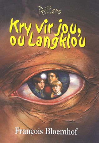 CS: The cover is a combination of three photos, some illustration and tearing paper and scanning it in. I try not to be influenced by an author’s previous work, since what is important to me for a cover is to communicate this one story, but I couldn’t help myself from thinking about François’ book “Kry vir jou ou Lanklou” when designing this. But in general I have to think about a first time reader picking up the book, someone who doesn’t know anything about the author.
As for fitting that huge title into the book, I knew it was going to have to be hyphenated, so I kept that in mind while considering the typography. Because it could not look clumsy.
AiW: How did your own visualising, your “seeing” of the book, when you were reading it relate to your designing process?
CS: I make a lot of notes while reading a book for a cover design, for this, I knew the main character was going to be on the cover, so I made notes about his appearance, so I can match the cover to the character. I had a completely different cover in mind while reading it, and as I got to the end, I realised that my initial idea had to be scrapped for something more evocative. So there is always a bit of slipping and sliding between ideas, I usually take a day or two after reading it to not think about the cover, and just think about the story, so when I start designing, I can reference what is in my head instead of working with a very clear idea and shoehorning it into the cover.
AiW: Bloemhof writes predominantly in Afrikaans and that’s the language of Verkleurmannetjie: would you say a text’s language affects your design process in any ways, and if so, could you speak a bit more on how?
CS: I would say no, being Afrikaans, I’ve always had a bit of a gripe with our tendency to try and isolate Afrikaans from the world. Growing up on the internet, my design aesthetic has always been a global one. So I try not to think of a book’s language when doing a cover.
AiW: Can I ask about spines and back covers? How much input did you have there? And, if relevant, how did that differ or relate to designing the front?
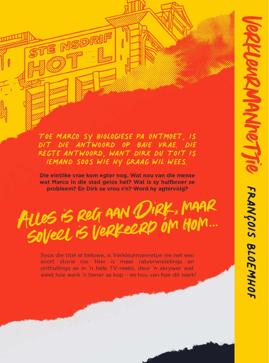
Schutte’s back and spine design for Verkleurmannetjie
CS: I did the layout for the spine and back cover, since they are just as part of the book as the cover. A cover makes you pick up a book, and you immediately flip it over to read the synopsis, so for back cover design you can be a bit more subtle, maybe bringing in a more obscure detail of the story, like I did with the illustration of the Hotel. A cover is a shout and a back cover is a conversation. And a spine is how you see the book in your bookcase everyday, if any of these elements feel out of place it can ruin a book cover.
AiW: A while back, there was discussion in the books community about book covers of African writers conforming to, and so perpetuating and confirming a certain aesthetic and expectation about writing from the continent – the “acacia tree meme” (summarised here at Africa is a Country). Thanks to designers out there doing and getting recognition for the sensitivity and intelligence of their work – such as your good self – and initiatives like GBAS, which can only help to put the significance of book cover design, among all the many ways a book is “pre-read”, to the forefront, this has been receding. But I wonder if a) you have any comment on this and b) as a follow-on, whether certain aspects of the market, local and/or international, if any, concern you when designing? And/or c) on a slightly different tack, do you worry about repeating yourself in your own design practice?
CS: This question made me giggle, I have long had a gripe with the “African Aesthetic” that certain books get. It is part of the reason why it took so long for me to finally get around to reading Chimamanda Ngozi Adichie, and it’s a shame. We hide our best stories behind sunset covers. One could go further and say that these types of covers are a leftover of a colonial mentality that portrays Africa as an empty continent, ready for exploitation. My favourite piece of writing about the portrayal of Africa is this piece by Binyavanga Wainaina, it perfectly summarizes the fetishisation of Africa in literature. And even talking about an “African Aesthetic” is completely absurd. A continent with more than 50 countries, being lumped together by single stories (thank you Chimamanda) and single aesthetics makes my blood boil.
The thing is, we have world class designers in South Africa, that are chomping at the bit to flex on our global counterparts. We want to show what we are made of. I really love this initiative by the GBAS, it shines a light on all of the incredible cover designers and illustrators that are working in South Africa. When you look at the finalists, there are no stereotypes and lazy shorthand, these covers are all works of art. It is honestly such an honour to even be included on this list in any way. They really show the diversity in stories and styles that we are lucky to have in South Africa.
The only thing that I focus on when designing a cover is whether it is striking, applicable to the story and setting and whether it echoes the story the author is telling. I like to design book covers that could feel at home anywhere in the world.
When a designer repeats themselves, it’s called developing a style 😉
But seriously, no. No two stories are the same, so no two covers should be the same.
AiW: Does your job affect what you buy and how you browse books in a bookshop, either irl or online? Do you have books you’re drawn to, for example, for reasons that you don’t entirely understand, or books you wouldn’t buy because of it? Does being a book cover designer make you more or less prone to judging a book by its outside?
CS: More than I’d like to admit. When I read a book with an ugly or generic cover I feel like I’ve betrayed myself. As someone who loves epic fantasy books, I’ve always had a bit of a bone to pick with the covers. It’s very rare that you get a fantasy book with a good cover. Some of my favourite books I’ve only bought because I’ve loved the covers, and then only when reading them I realised what incredible books they are.
A few examples are:
- The Institute of Taxi Poetry by Imraan Coovadia,
- Zoo City by Lauren Beukes,
- and the whole Penguin graffiti series of covers, especially And the Ass saw the Angel by Nick Cave.
I am a firm believer of judging a book by its cover (this belief does not extend to people), but a good cover can make or break my enjoyment of a book.
AiW: What is your favourite cover that you did not design? Are there specific designers who have influenced the ways in which you look at a new project?
CS: There are too many to name, but these are the ones I can think of, off the top of my head:
- Tampa by Alissa Nutting,
- 1984 by George Orwell (The Shepard Fairey cover),
- The Memory Police by Yoko Ogawa,
- What A Carve Up! by Jonathan Coe (The Broken Fingaz cover),
- Invisible Monsters by Chuck Palahniuk.
I love the way these designers use metaphor and clever design principles to convey stories.
AiW: Any book recommends for our readers?
CS: I’m currently in a bit of a fantasy phase, reading the Kingkiller Chronicles by Patrick Rothfuss again, but I try to read as much as I can so here are some of my all-time favourites:
- Call Me By Your Name by André Aciman,
- Moxyland by Lauren Beukes,
- Ways of Seeing by John Berger (More of an essay but whatever),
- Pyongyang by Guy Delisle (Graphic Novel),
- House of Holes by Nicholson Baker,
- Americanah by Chimamanda Ngozi Adichie,
- Collective Amnesia by Koleka Putuma (Poetry),
- Things Fall Apart by Chinua Achebe,
- Wild Sheep Chase by Haruki Murakami,
- Blankets by Craig Thompson (Graphic Novel),
- Opus by Satoshi Kon (Manga),
- Dune by Frank Herbert,
- The Picture of Dorian Gray by Oscar Wilde,
- Saga by Brian K. Vaughan and Fiona Staples (Comic Book series).
Thanks again for sharing and talking with us!
![]()
 Casper Schutte is an award-winning creative with experience in building brands and creating engaging content. He has a design studio, Spook Design Co., based in Cape Town South Africa. Spook specialises in design, branding and illustration. Check out Spook Design Co.’s Instagram and Behance.
![]()
Check out the finalists in each category, as well as all the covers entered in the GBAS Book Cover Design Award gallery.
![]()
And for more on the awards from GBAS founder Paige Nick, you can read her AiW Words on the Times with us here:
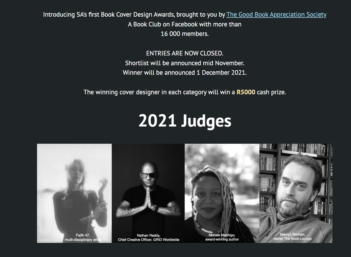
Paige Nick, GBAS: I run a book club on Facebook called The Good Book Appreciation Society. It’s a kind of secret club with almost 17,000 avid reading members. So I guess, luckily, it’s a badly kept secret.
As an author and advertising copywriter, I’ve always been fascinated by book covers and the design side of books. I know how hard they are to get right and thought it would be great to give our designers some credit, and some cash. The awards kind of came up out of that.
Categories: Conversations with - interview, dialogue, Q&A
 Q&A: Words on… Noisy Streetss’ ‘Love in Detty December’ anthology, III
  Words on… Maik Nwosu: A Voice above the fray (Q&A)
  Q&A: Spotlight Interview with Ellah Wakatama, Chair of the Caine Prize for African Writing
  Q&As: Nadia Davids’ ‘Bridling’ – on the Caine Prize Shortlist 2024
join the discussion: